Targeting screen size and resolution
Here are some personal tips collected over the last while for making Android apps more slicker, and less buggy when it comes to UI & layout design.
There are currently over 100 different screen sizes on Android, and an even greater profusion of resolutions. To make your app look good on different screen configurations there are two things you’ll need to make sure of:
- You have a good layout or structure for different screen sizes
- Your images work well at different resolutions
These are independent tasks, you might have a super tablet layout, but your graphics could look horribly bobbly on it. We’ll look at them in turn.
Designing layouts for multiple screen sizes
Tip 1: ScrollViews and ListViews are an easy win.
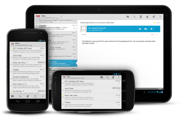
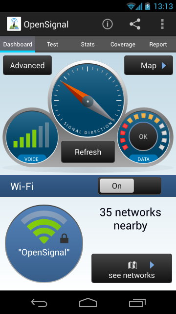
While there are a huge array of screen sizes, most of the variation – for phones at least – is in the screen height. For this reason ScrollViews and ListViews work well. They’re not appropriate for all views, however. For the dashboard tab in an example app called Signal, users should see everything all in one go, without scrolling. For the more advanced stats tab, scrolling is not such a bad thing. If you can design your layouts so they work well across all screens without using a scrollview, do so, but it’s an easy way of making sure it works on a lots of screens.
Dashboard style screens shouldn’t scroll
Tip 2: Use the folder structures. The resource folder structure is powerful in Android, it allows you to vary images/strings/layout files/dimensions/colours depending on the api level/language/screen size/screen resolution among other things. Here’s an example of some of the things you can do with it:
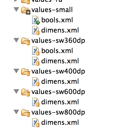
In values-small (above) I have a bools.xml file, this contains a line:
1 | true |
In the code I reference that like so:
1 2 3 | if(getResources().getBoolean(R.bool.small_screen)){ getSupportActionBar().hide(); } |
On small screened devices that boolean is found to be true and I hide the ActionBar to save space. This is actually using the marvellous ActionBarSherlock, more on that later. In values-sw360dp – so for screens wider than 360dp – I have
1 | false |
For large screens, the ActionBar is not hidden.
I don’t need to include the bools.xml file in values-sw400dp, because of the way that the OS searches for resources. For example for a device of width 600dp (600/160=3.75 inches, so this is what we generally call a 7″ tablet) the OS will look for a bools.xml in values-sw600dp and fail, look again in values-sw400dp and fail, then look in values-sw360dp and look no further.
Tip 3: 160dp = 1 inch. 320 dp = 2 inches. dp == dip
Tip 4: you can use these folder structure tricks for all resource types
For example you can use the system of appending folder names for XML layouts e.g. layout-sw360dp can be used if you have a layout file you want to target to screen width 360dp. If you want to switch the layout between portrait and landscape you can go one step further:
1 2 | layout-sw360dp-land layout-sw360dp-port |
But wait, half your users will speak Arabic? You probably want to flip your layout right to left, try:
1 2 3 4 5 | layout-sw360dp-land layout-sw360dp-port layout-sw360dp-land-ar layout-sw360dp-port-ar |
The first two files will get served for all other languages, your -ar files just for Arabic.
Tip 5: Resource rules of thumb:
1 2 3 4 | XXX // i.e. no append to the folder name: default – use this for Nexus One, Droid 2, S2 XXX-sw360dp // larger phones – Galaxy Nexus, S3, S4 XXX-sw600dp // 7? tablets XXX-sw720dp // 10” tablets |
For Kindle devices things differ, use:
1 2 | XXX-large-mdpi // kindle fire 7? XXX-large-hdpi // kindle fire 7? HD |
Tip 6: you don’t have to tailor all your layout files, you could instead tailor the dimens.xml files. In the screenshot a few paragraphs up, you’ll notice that I have a lot of dimens.xml files in my values folders, that’s because I prefer to work with a single set of layout.xml files, within each layout file I have code like:
1 |
Where e.g. small_margin is defined in a dimens.xml file:
1 | 4dp |
That 4dp varies between all the dimens files. I have an Excel file that creates all these different dimension definitions based on scaling up by a certain factor. You might ask: why not just let the Android OS handle all the scaling? Why not, instead of hardcoding all values, just use one values folder and one layout folder? That would work, everything would get scaled if it was properly set up, but some elements look stupid scaled.
Tip 7: Let whitespace scale more than graphics. Let graphics scale more than buttons.
Buttons, checkboxes, toggles look stupid when scaled up. A button that’s 100dip (0.63?) on a phone does not want to become 200dip (1.25?) on a tablet of twice the screen width. Just because the screens are bigger, it does not mean that tablets are used by giants. Instead, let the space between buttons increase while your shiny dials and images expand.
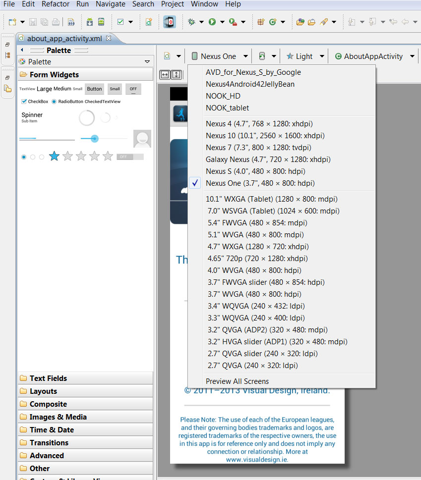
Tip 8: Use the GraphicalLayout tool for fast previews.
GraphicalLayout is the WYSIWG editor for XML files. I prefer to write all my elements directly – instead of dragging and dropping – but after adding some elements, test out your layout on various screen sizes by toggling the GraphicalLayout selecting from the dropdown.
Lots of options, use them.
Scaling Images
Tip 9: Don’t scale all your images.
Getting the layout files to adjust to different screen-sizes is just half the battle, the elements themselves (e.g. images) must work when blown up onto high-res screens. The conceptually simplest way of doing this is to produce a whole host of images and pop them into a matching plethora of drawable folders:
1 2 3 4 5 | drawable-sw600dp-ldpi drawable-sw600dp-mdpi drawable-sw600dp-hdpi drawable-sw600dp-xhdpi drawable-sw600dp-xxhdpi |
…and the same for other screen widths.
Don’t do this.
You will go insane in the membrane.
Having drawble-ldpi, drawable-hdpi, etc. folders might be worthwhile, but you don’t necessarily need to have all of them.
Tip 10: Avoid bitmaps (jpg, png).
For some images – such as icons – bitmaps might be the best option, as they are simple to include. But where possible avoid them, you can save a lot of space and achieve much sharper results by using different methods.
Tip 11: Use XML Drawables.
Wherever you can use XML drawables instead of bitmaps. XML drawables won’t let you do everything, but I was surprised by how flexible they are. Android developer docs have a full overview, but here’re some tasters:
This defines a rectangle with rounded corners, a border (darker blue) and a gradient. In layout files you can set it whatever width you like and it will look crisp on any screen. Ideal for buttons.
Tip 12: Use more XML Drawables.
Just to get you a bit more excited about XML drawables, the radar background below is a rather more complex example:
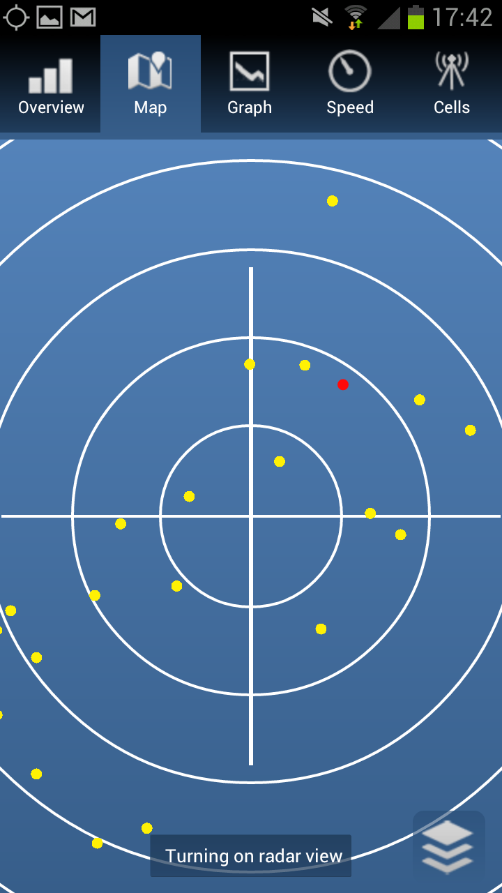
No bitmaps were harmed in the making of this UI (except the icons).
Tip 13: Use yet more XML Drawables (with bitmaps if you must).
How did we build the super cool icons for WeatherSignal – the lightbulb that dynamically fills up depending on light intensity and the pressure needle that rotates? Here we used bitmaps in conjunction with XML:
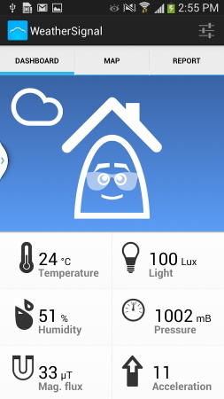
For the lightbulb we used two PNGs: icon_magnitude_min (an empty lightbulb) and icon_magnitude_max (one filled with light) and we dynamically cropped the latter. To set this up I used:
1 |
In the java I get I reference to the clipdrawable and control its level based on light intensity.
Tip 14: Why use 9-patch (when you can use XML drawables)?
Android have the option to use 9-patches to define drawables, a number of tutorials illustrate how to use them to make a button that can stretch while keeping the same corners (and avoiding pixellation). If you know how to use 9-patches already, perhaps from web design, then they might be worth using. If you’re unfamiliar with 9-patches I would advocate remaining that way. Creating 9 patches is more involved than creating most bitmaps and if you want to adjust anything – e.g. corner radius or the colours, it’s back to the graphics editor. Much of what 9-patches are used to achieve can be done through XML.
Tip 15: Create custom views by overriding onDraw().
There are some things XML just isn’t so great at, we draw a lot of graphs in OpenSignal and WeatherSignal and there are libraries for this, but we coded our graphs custom. It’s kind of fun. You might never need to do it, but to make graphics that are highly dynamic and custom it is often the only way to go.
Tip 16: Use SVG where you can’t use XML.
Sometimes overriding onDraw() and painstakingly coding up all the lines and arcs you need to draw your custom view is overkill. After all, there is a language for vector graphics, it’s called … Scalable Vector Graphics. It’s what powers one of the coolest Android apps ever – Androidify. In fact they built the library just for that app, and they released it here: SVG for Android It’s what we used to draw the dashboard in OpenSignal.
Tip 17: GZip your SVG files. Makes them smaller and they parse quicker.
Tip 18: The SVG library doesn’t support everything. In particular some alpha channels don’t seem to work, you may even have to edit them out in the code.
Targeting consistent appearance across all Androids versions
Tip 19: On some Android OS’s (TouchWhizz/HTC Sense/MotoBlur etc) the default buttons and other UI widgets will look very different to how they look on stock Android. I wish it weren’t so, but there it is.
Tip 20: Customise your UI widgets. To make sure your app looks the same on all devices, you’ll need to customise everything, it’s not as hard as you might think and in doing so you’ll get a lot more control over how your app looks.
Tip 21: Selectors are super for building buttons. We saw above how to define a button background in XML, but what do you do to create a button that changes when clicked? Easy: define the background to be an XML file as below, which will receive the button state and serve up the appropriate drawable.
1 2 3 | <!--?xml version="1.0" encoding="utf-8"?--> <!-- default --> |
Tip 22: The ActionBar and many animation styles didn’t exist pre Honeycomb, use ActionBarSherlock and NineOldAndroids instead.
Jake Wharton’s Android libraries are a tour de force of backwards compatibility. As a bonus, it ABS also gives you more power of customising the ActionBar.
Targeting speed
Tip 23: Test on slow phones. You’ll not only see any problems with slowness, but they’ll drive you nuts, no-one likes a slow app.
Tip 24: Keep your XML layout hierarchy flat. More layers means the system does a lot more work parsing your code and it can take views longer to deploy.
Tip 25: Use Android Lint. Right click on project folder in Eclipse>Android Tools>Run Lint. This can catch a host of things that can improve speed, or just make your code cleaner.
Tip 26: Android Lint can get it wrong. It can suggest things that will break your code in subtle ways, so do understand what it suggests before you make changes.
Tip 27: Using <merge> can help flatten your view hierarchy. Simple way of getting rid of superfluous layers. Great post explaining this and the difference it makes on Android Developers.
Tip 28: Use HierarchyViewer to see your layout hierarchy in its gory glory. This is a brilliant tool which shows just how many layers of layouts you have and which of them are slowing things down.
Tip 29: Use RelativeLayout whenever you can. AbsoluteLayout is deprecated, don’t use it. Often you will have a choice between RelativeLayout and LinearLayout, go with RelativeLayout as you’ll almost always end up with fewer layers in your view hierarchy. An example, suppose you want to make a view something like:
Box A takes up left half of the screen | Box B takes up right half of the screen
Your first instinct is probably to use:
1 |
That works just fine, but you could also use:
1 |
This second form doesn’t look much better than the first, in fact it looks worse: we’ve introduced a whole new element. But suppose we want to add in image into each box, schematically:
Box A takes up left half IMAGE | Box B takes up right half IMAGE
Pursuing the first method, you’d need to introduce a second level of LinearLayouts, pursuing the second you could put your images directly into the same RelativeLayout – for example by specifying that the first image should be to the left of “dummy_center” and TextView A should be to the left of that. So you’d have 7 elements across 3 levels of view hierarchy (LinearLayout way), versus 6 elements across 2 levels (RelativeLayout). All this stuff adds up.
Tip 30: Use external profilers as well as DDMS. These help you see unnecessary network calls, watch power usage, garbage collection, state changes (e.g. when onStop and onDestroy are called). LittleEye is my current favourite.
Tip 31: Use AsyncTasks. The Android team must have got so fed up with people making network calls on the UI thread that they turned it into a compile error a few API levels back. But there’s probably a lot of other work in any app that can be take off the UI thread, allowing layouts to render faster and improving its responsiveness.
Targeting low file size
Tip 32: Some Android devices have a 100mb limit. Things are changing, but there’s still a lot of users out there who will have to think a lot about whether a 5Mb app deserves its space. If you allow users to install to the SD card, it’s not a problem but you shouldn’t allow this if your app needs to start onBoot (e.g. for most widgets). Even for newer devices, users are going to be happier if your APK is small so it downloads quicker.
Tip 33: Use XML resources (last time I recommend this, I promise) These save a tonne of space over PNGs, as you only need one for many screen configurations and a single XML file is almost always smaller than a PNG showing the same thing.
Tip 34: When you must use PNGs always optimize (with PNGCrush or ImageOptim)
Targeting bugs
Tip 35: On the Android developer console check for any bugs that have been sent automatically.
Tip 36: ProGuard is turned on by default now. Proguard is awesome (speeds up your app and reduces filesize) but it can make StackTraces very obscure. You’ll need to retrace the StackTraces, to do this you’ll need to hang onto the Proguard mapping files created on each build, I put them into a folder with the version code’s name.
Tip 37: Adjust ProGuard config to show line numbers in StackTraces. Make sure your proguard.cfg has a line:
1 | -keepattributes SourceFile,LineNumberTable |
Tip 38: Use staged rollouts Test the waters on 5% of devices, watch for bug reports.
Tip 39: Use a device testing lab Device Anywhere and Perfecto Mobile offer virtual testing labs where you can log onto a real device. I find them sort of clunky and often the devices are kind of messed up by being so unceasingly tested on. If you work out of a co-working centre, or have several Android developer friends get a “device pool” going.
Tip 40: More code less blog posts. Nah, sharing is caring, I just can’t think of a 40th.
Read about multiple screen size design on the Opensignal Developers Blog.